Week 24: Showtime

After a few weeks of planning, this week I hosted a bumper show-the-thing session at our digital prevention services all-hands.
My aim was to try and give people a sense of how all our different services contribute to the full end-to-end journey of someone getting a vaccination.
From the public perspective this starts with a notification and invitation message in the NHS App (also sent by email and letter if needed). Then there’s the vaccination booking service. And finally seeing the vaccination record in the NHS App.
From the staff perspective there are a number of services involved, including the one I’ve been working on, Record a vaccination.
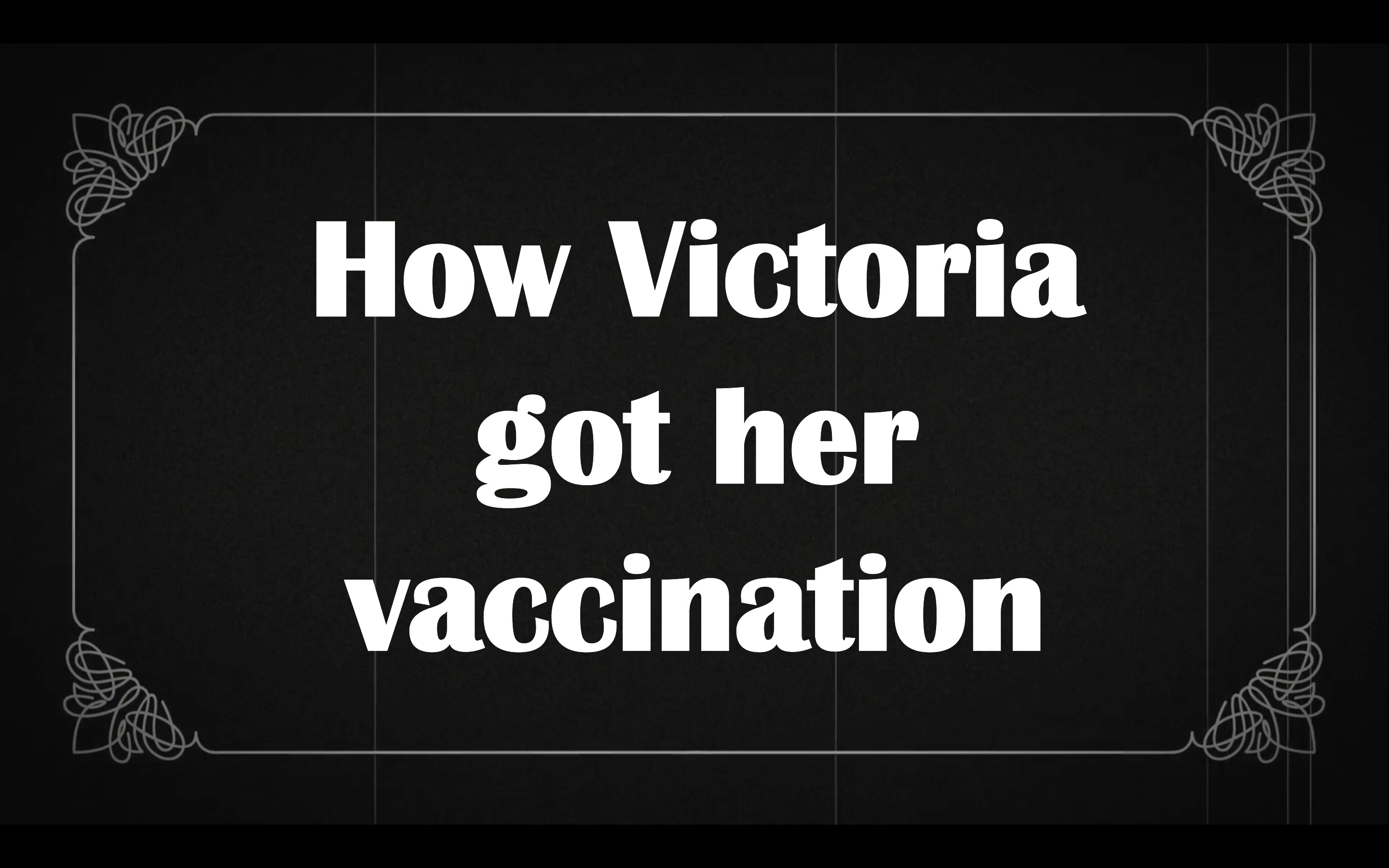
I thought the best way to bring this all together was with a bit of storytelling. And so with a few old movie style title cards, I introduced ‘How Victoria got her vaccination’.
We had 6 live demos, from presenters across entirely different teams, with a fictional main character – Victoria Vaxwell – as the through-line holding the narrative together. All in 20 mins.
I had a slightly nervous moment watching the presentation in the slot before ours, which was a more formal set of slides introducing OKRs, that maybe I’d gone too far with the schtick. But I think I got away with it.
We kept to time. The rehearsal had helped, and a ‘green room’ channel I’d created on Slack worked well for co-ordinating and thanking the presenters.
Afterwards I got lots of nice feedback from people saying they enjoyed it and found it useful. And a couple of suggestions for where the services could be more joined-up. Which is great: that was half the point.
Change NHS

The big NHS news this week was the launch of a national conversation to help fix the NHS.
The public face of this is Change.nhs.uk, where people are invited to contribute their experiences of the NHS and ideas for change.
Of course there are some ‘comedy’ ideas submitted, but the highest-rated ones seems sincere. I created an account and added my thumbs up to the ones I most agreed with.
I had some comments too about the website itself, an off-the shelf platform called Go Vocal, which I’ve fed back through various channels.
The news was followed by a second announcement of new data laws to improve public services. I can’t pretend to have read the proposed bill but part of it aims to make patient date more easily transferable across the NHS.
I’ve no idea how the estimated 140,000 hours of NHS staff time that it’d save was calculated. But data admin definitely takes up a lot of time.
Public Digital responded with an thoughtful post on patient records and the NHS App, with conclusions that are both pragmatic and radical.
Their post also notes (with a screenshot) that the way vaccination records are presented in the app is not the most user-friendly. Thankfully another team is already exploring this.
Links
- Front-end dev standards from Benjy Stanton lists some suggestions for a ‘definition of done’ when passing work from design to development. I might borrow this.
- Vicky Teinaki joined us in digital prevention services last week. An interaction design supergroup? 😊
Half term next week. I haven’t got the whole week off, but we are doing a Legoland trip on Monday! 🎢