Week 92: 3 novel interfaces
After a couple of weeks of perhaps overwrought weeknotes, this week I return to the traditional format of wot-I-did-this-week.
As part of my leadership role I try to encourage designers to work in the open and share their work in progress. This can understandably take people a while to get comfortable with.
So in this spirit, I’ll share 3 bits of interface design I’ve been working on, each of which is somewhat new and I’m not 100% sure of yet.
Search and select
The first aims to solve an issue I mentioned in a previous week, which is a screen of checkboxes listing pharmacies within a single company. Often this will be a short list, but it can be quite long, and in a few cases very long!
To make this a bit more manageable, I’ve now added a:
- ‘select all’ checkbox
- search input which filters the checkboxes as-you-type
- updating count of the number of selected checkboxes
- scrollable region with a maximum height
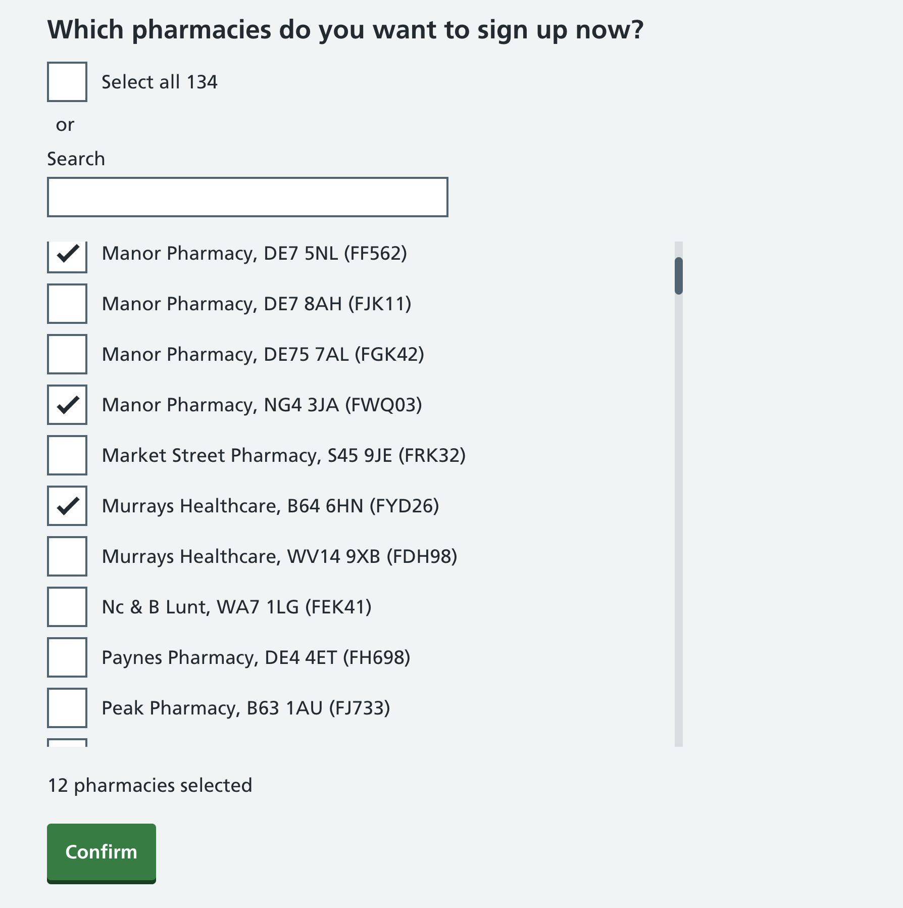
The search lets you filter on pharmacy name (although they might all be the same), partial or full postcode, and the ODS code. Ideally I’d include the first line of the address too, but the ODS search API doesn’t seem to include that.
The design is based in part on the organisation filter on the GOV.UK Guidance and regulation page, but repurposed for a new context
Check a list
The next page then lists the selected pharmacies, and a ‘remove’ button in case you selected one by mistake. Clicking the button instantly removes that item from the list, with no undo.
If you’ve missed an item from the list and need to add it, you have to go back to the previous page.
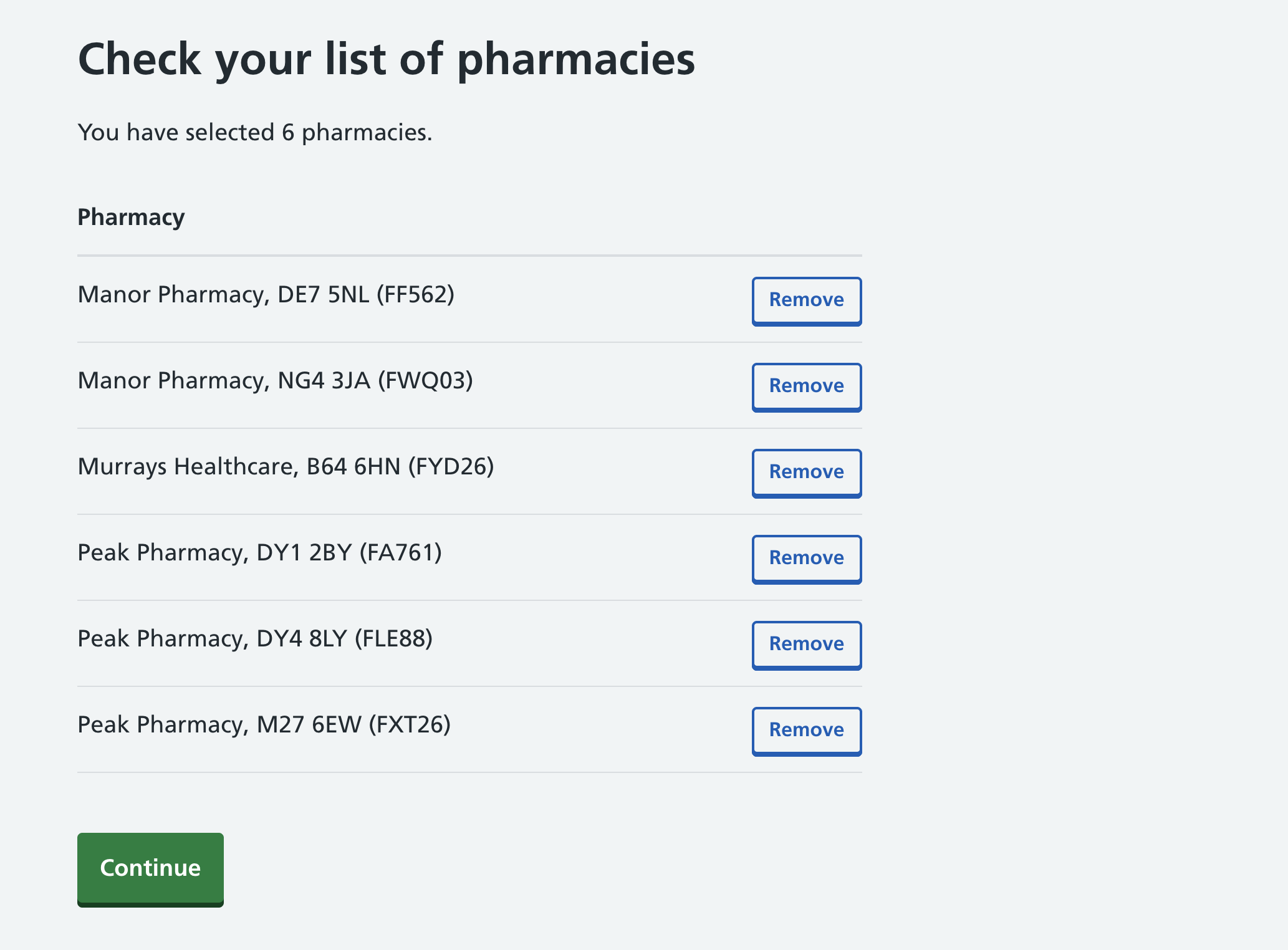
It’s quite possible that this screen isn’t needed at all, but I felt that it might be helpful and provide some extra reassurance.
Add another
The third new interface asks for a name and email address for a lead administrator, but lets users add up to 9 additional lead administrators using a button.
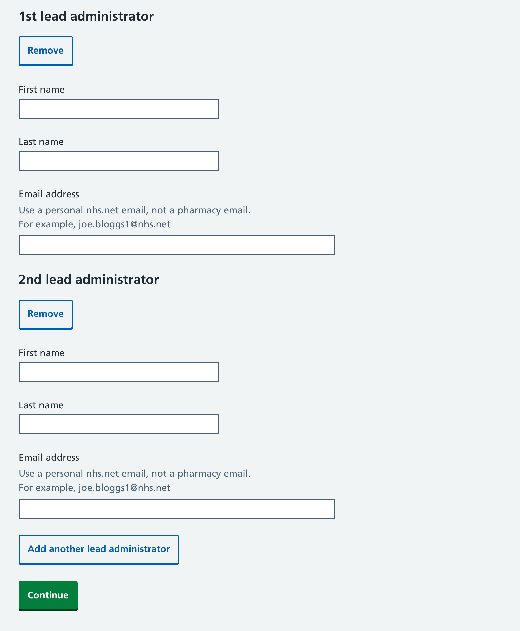
This pattern isn’t entirely novel, as it’s based on the Add another component from the Ministry of Justice. However I made some changes, left-aligning the ‘Remove’ buttons, and adding ‘2nd’, ‘3rd’ etc to the headings to help users keep track.
Sketching in code
Each of these 3 interfaces involves a fair bit of JavaScript, and for some of them I’ll admit that I used AI to help, which saved time.
Interfaces like this can only really be explored in a fully working and interactive way, which is why I promote sketching in code rather than Figma.
We’re doing some user testing on them next week, and I’ll publish some notes on the findings.
Links
- RSV maternal vaccine cuts baby hospital admissions by up to 85% from UK Health Security Agency - I’m proud to have had a small role in this
- Should you really trust health advice from an AI chatbot? from BBC News
- 4 things to do before integrating breast screening with GP records from Vero Jermolina
- From garbage can to compost heap by Mike Gallagher
Went to Legoland with my son at the weekend. He didn’t want to do the Driving School ride as he sees no need to learn to drive. Such a city kid.